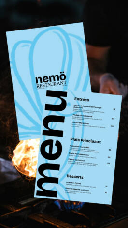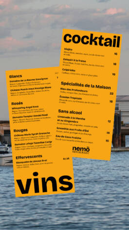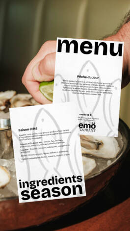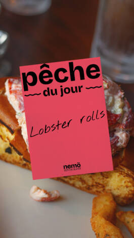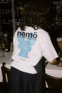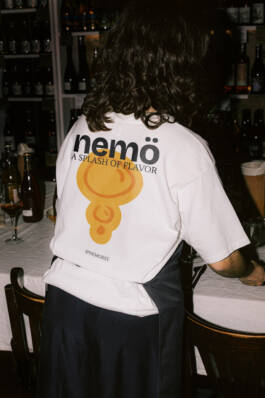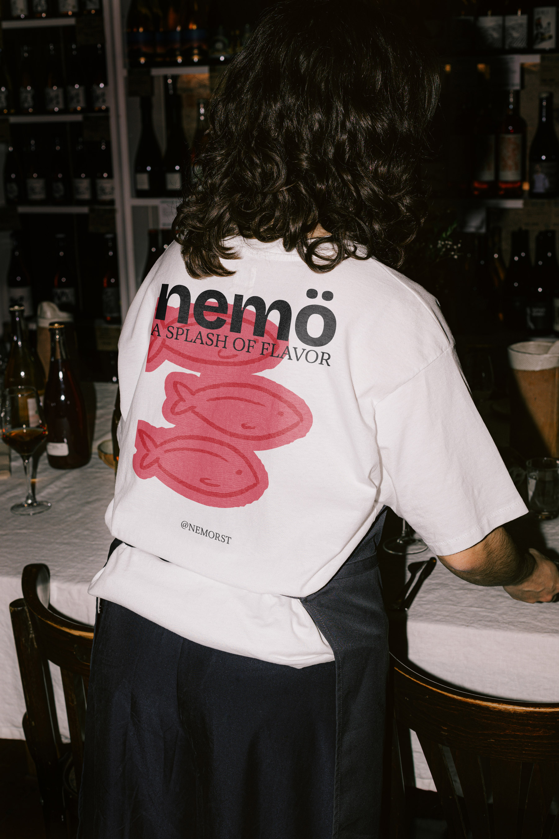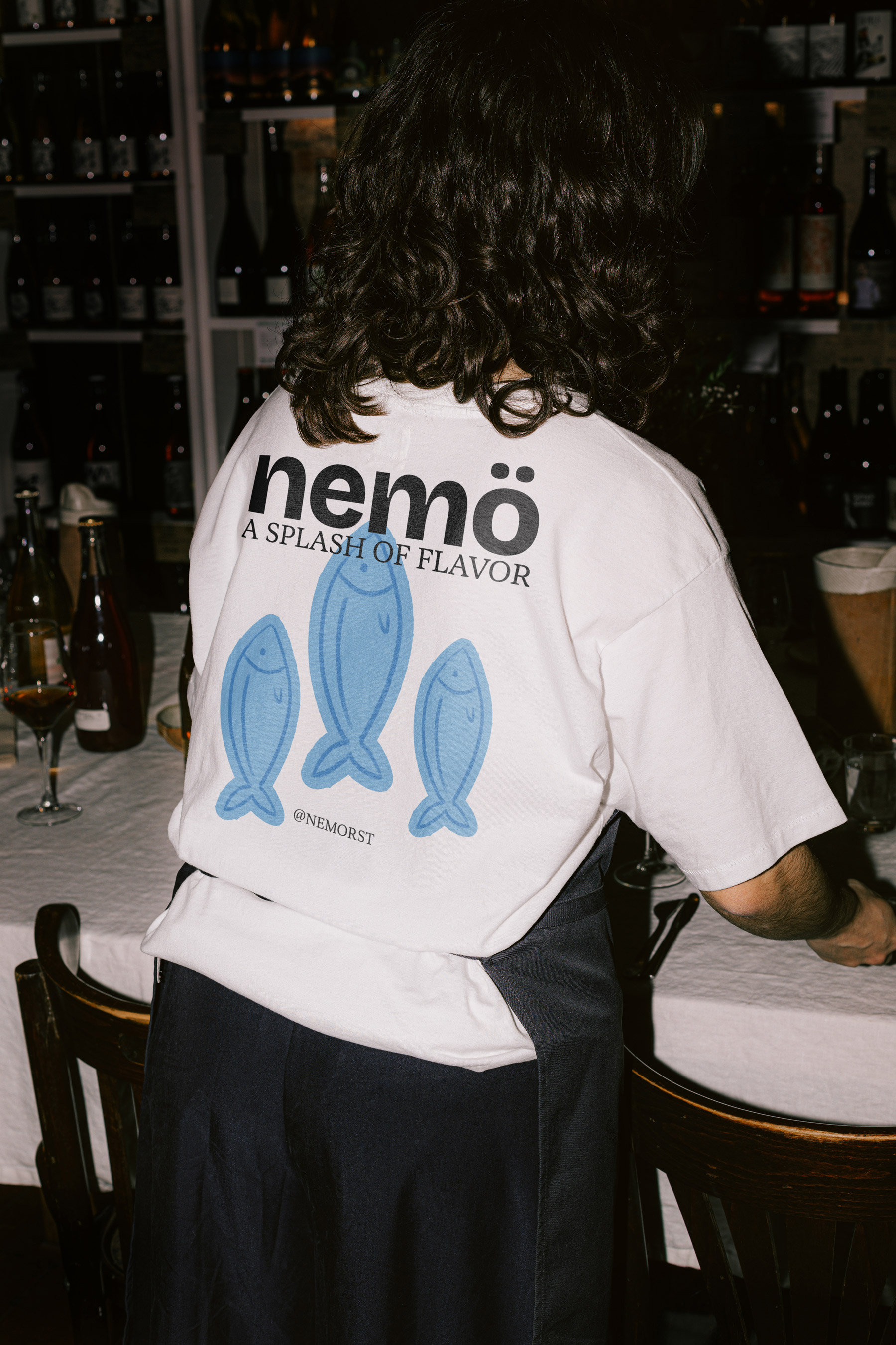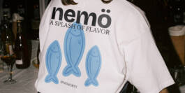
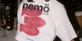
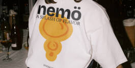
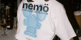
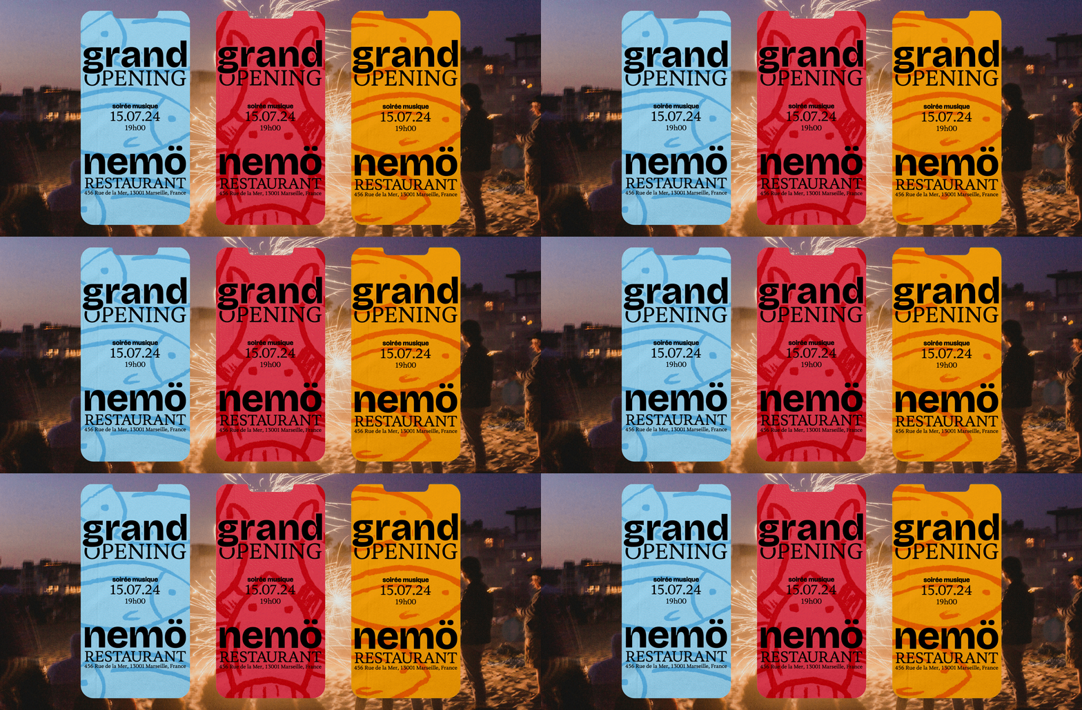
The "Street Food" concept embraces the modern culinary trend of gourmet street food, focusing on freshness, sustainability, and adaptability, with a special emphasis on the "catch of the day." These qualities elevate the restaurant’s offerings while the branding conveys a fun and laid-back atmosphere that looks toward an optimistic future, aiming to attract the next generation of diners. The visual identity reflects a commitment to environmental responsibility, featuring bold typography and vibrant colors to highlight the brand’s message. The dynamic design, along with photography that fosters a positive, forward-looking mood, positions the restaurant as a relaxing place to enjoy. The name "Nemo," derived from Greek, means "to distribute, to share," further reinforcing the restaurant’s ethos.
The branding is bold, dynamic, and full of energy. It uses strong typography to make a statement, emphasizing the restaurant's mission to be audacious and forward-thinking. Vibrant colors project optimism and a sense of fun, while the photography radiates positivity and "good vibes." The playful yet purposeful design reflects the brand’s commitment to standing out and being memorable, with a clear message that boring is bad for business.

The restaurant’s vibe centers on enjoying fresh, gourmet food in a relaxed, outdoor setting. It invites diners to share meals by the sea, soaking up the sun and the natural surroundings. With a focus on fresh ingredients and a communal atmosphere, the experience is laid-back, joyful, and full of simple pleasures.
The idea of offering a picnic blanket is to further enhance the restaurant’s essence. Nemo invites its guests to enjoy a meal by the sea, sitting on the beach. This is made possible by the gourmet street food, which is easy to eat, like during a picnic. To facilitate this, the restaurant provides blankets so customers can comfortably settle on the beach, extending the experience and the unique atmosphere the brand aims to create.
The delivery bag is white to represent the restaurant's high-end aspect, while also symbolizing that within this simple packaging lies a world full of color. The boxes have a standard format that adapts to the different recipes the chef may offer.
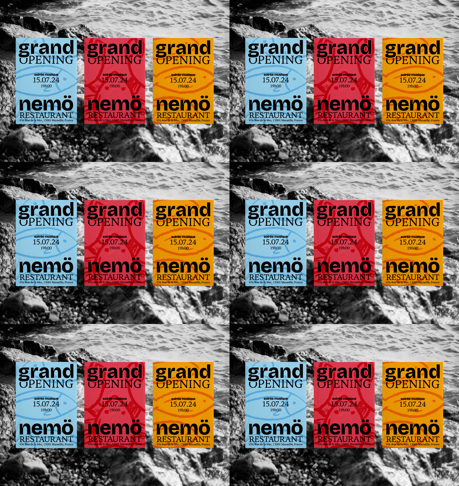
The use of bright colors and strong messaging sets the tone for a fun, memorable experience, inviting guests to join in the celebration of gourmet street food with a fresh, modern twist.
The restaurant embraces gourmet street food with a focus on freshness, sustainability, and adaptability. Its branding is fun, laid-back, and environmentally conscious, using bold typography and vibrant colors. "Nemo" means "to share" in Greek, reflecting the brand's ethos.
The branding uses bold typography and vibrant colors to project energy, optimism, and fun. It emphasizes standing out with a clear message: being bold and memorable is key, while boring is not an option.
The restaurant’s vibe focuses on enjoying fresh, gourmet food in a relaxed, outdoor setting. It creates a joyful, communal atmosphere by the sea, offering simple pleasures and a laid-back experience.
The restaurant enhances its beachside dining experience by providing picnic blankets, encouraging guests to enjoy gourmet street food comfortably by the sea. This aligns with the brand’s relaxed, seaside atmosphere.
The white delivery bag represents the restaurant’s high-end feel, while the simple design hides a world full of color. The standardized boxes adapt to various recipes from the chef.
The bright colors and strong messaging in the posters invite guests to the grand opening, offering a fun, memorable experience with a modern twist on gourmet street food.