

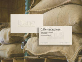
Buna is a roasting house founded with the aim of offering the very best coffee beans. Every stage, from harvesting to roasting, has been carried out with the utmost care to offer you the very best.
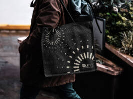
The concept behind the logo is to represent the refinement of the product through a thick to thinner typography.
Mix between
FACT & OCTANE Typeface Family


Buna is a roasting house founded with the aim of offering the very best coffee beans. Every stage, from harvesting to roasting, has been carried out with the utmost care to offer you the very best.
The concept behind the logo is to represent the refinement of the product through a thick to thinner typography.




BUNA
CREATIVE SERVICES: art direction, branding, packaging
GRAPHIC DESIGN - (NON COMMERCIAL WORK)
YEAR: 2022


Buna is a roasting house founded with the aim of offering the very best coffee beans. Every stage, from harvesting to roasting, has been carried out with the utmost care to offer you the very best.
The concept behind the logo is to represent the refinement of the product through a thick to thinner typography.
Mix between
FACT & OCTANE Typeface Family


Buna is a roasting house founded with the aim of offering the very best coffee beans. Every stage, from harvesting to roasting, has been carried out with the utmost care to offer you the very best.
The concept behind the logo is to represent the refinement of the product through a thick to thinner typography.


BUNA
CREATIVE SERVICES: art direction, branding, packaging
GRAPHIC DESIGN - (NON COMMERCIAL WORK)
YEAR: 2022

Scroll up ↑